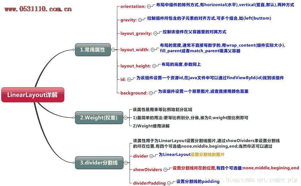
本节引言
本节开始讲Android中的布局,Android中有六大布局,分别是: LinearLayout(线性布局),RelativeLayout(相对布局),TableLayout(表格布局) FrameLayout(帧布局),AbsoluteLayout(绝对布局),GridLayout(网格布局) 而今天我们要讲解的就是第一个布局,LinearLayout(线性布局),我们屏幕适配的使用 用的比较多的就是LinearLayout的weight(权重属性),在这一节里,我们会详细地解析 LinearLayout,包括一些基本的属性,Weight属性的使用,以及比例如何计算,另外还 会说下一个用的比较少的属性:android:divider绘制下划线!
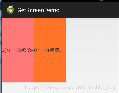
1.本节学习图
2.weight(权重)属性详解:
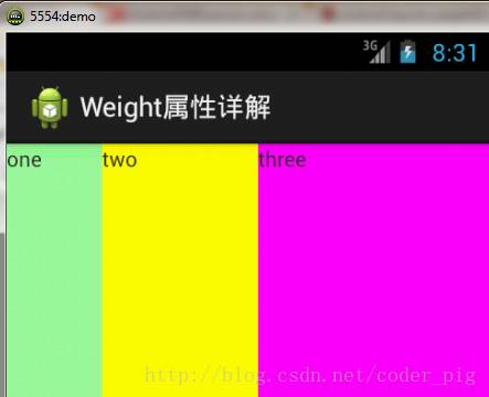
①最简单用法:
如图:
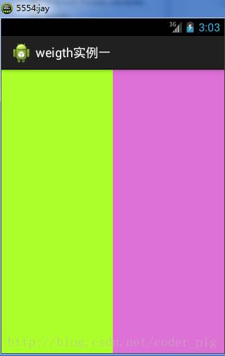
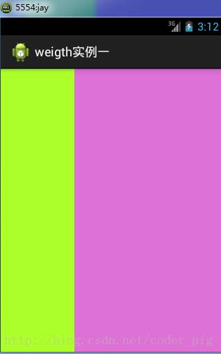
实现代码:
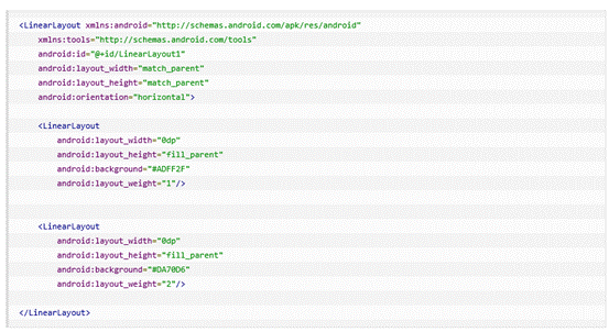
要实现第一个的1:1的效果,只需要分别把两个LinearLayout的weight改成1和1就可以了 用法归纳: 按比例划分水平方向:将涉及到的View的android:width属性设置为0dp,然后设置为android weight属性设置比例即可;类推,竖直方向,只需设android:height为0dp,然后设weight属性即可! 大家可以自己写个竖直方向的等比例划分的体验下简单用法!
②weight属性详解:
当然,如果我们不适用上述那种设置为0dp的方式,直接用wrap_content和match_parent的话, 则要接着解析weight属性了,分为两种情况,wrap_content与match_parent!另外还要看 LinearLayout的orientation是水平还是竖直,这个决定哪个方向等比例划分
1)wrap_content比较简单,直接就按比例的了
实现代码:
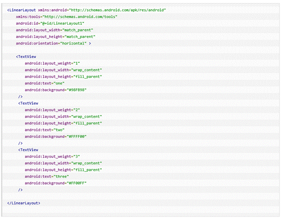
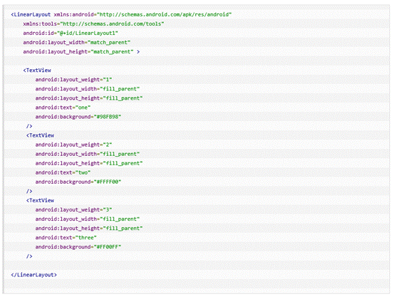
2)match_parent(fill_parent):这个则需要计算了
我们写这段简单的代码:
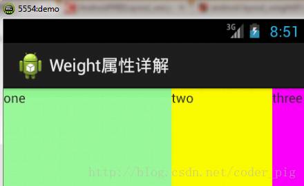
运行效果图:
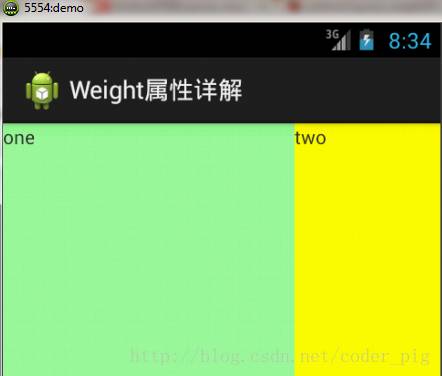
这个时候就会有疑问了,怎么会这样,这比例是2:1吧,那么three去哪了?代码里面明明有 three的啊,还设置了3的,而1和2的比例也不对耶,1:2:3却变成了2:1:0,怎么会这样呢? 答:这里其实没那么简单的,还是需要我们计算的,网上给出的算法有几种,这里就给出笔者 觉得比较容易理解的一种: step 1:个个都是fill_parent,但是屏幕只有一个啦,那么1 - 3 = - 2 fill_parent step 2:依次比例是1/6,2/6,3/6 step 3:先到先得,先分给one,计算: 1 - 2 * (1/6) = 2/3 fill_parent 接着到two,计算: 1 - 2 * (2/6) = 1/3 fill_parent 最后到three,计算 1 - 2 * (3/6) = 0 fill_parent step 4:所以最后的结果是:one占了两份,two占了一份,three什么都木有 以上就是为什么three没有出现的原因了,或许大家看完还是有点蒙,没事,我们举多几个例子试试就知道了!
比例为:1:1:1

按照上面的计算方法算一次,结果是:1/3 1/3 1/3,没错
接着我们再试下:2:3:4
计算结果:5/9 3/9 1/9,对比效果图,5:3:1,也没错,所以这个计算方法你可得mark下了!
③Java代码中设置weight属性:
setLayoutParams(new LayoutParams(LayoutParams.FILL_PARENT,
LayoutParams.WRAP_CONTENT, 1));
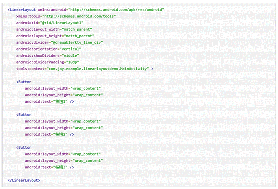
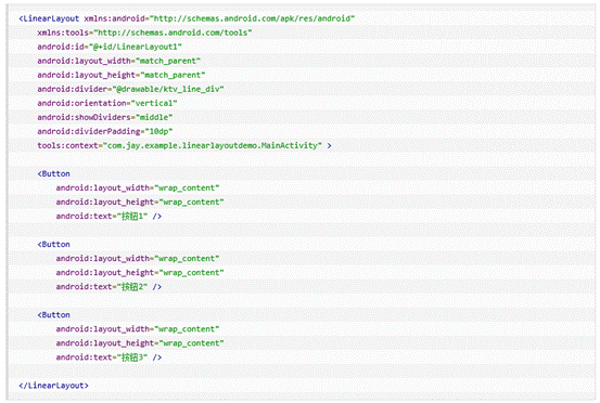
3.为LinearLayout设置分割线
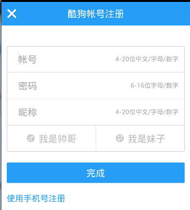
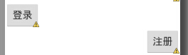
很多界面开发中都会设置一些下划线,或者分割线,从而使得界面更加整洁美观,比如下面的酷狗 音乐的注册页面:
对于这种线,我们通常的做法有两种 ①直接在布局中添加一个view,这个view的作用仅仅是显示出一条线,代码也很简单:
<View
android:layout_width="match_parent"
android:layout_height="1px"
android:background="#000000" />
这个是水平方向上的黑线,当然你也可以改成其他颜色,或者使用图片
②第二种则是使用LinearLayout的一个divider属性,直接为LinearLayout设置分割线 这里就需要你自己准备一张线的图片了 1)android:divider设置作为分割线的图片 2)android:showDividers设置分割线的位置,none(无),beginning(开始),end(结束),middle(每两个组件间) 3)dividerPadding设置分割线的Padding
使用示例:
实现代码:
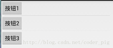
4.LinearLayout的简单例子:
实现代码如下:
5.注意事项:
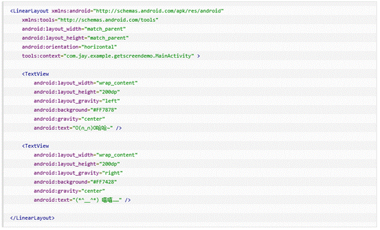
使用Layout_gravity的一个很重要的问题!!! 问题内容: 在一个LinearLayout的水平方向中布置两个TextView,想让一个左,一个右,怎么搞? 或许你会脱口而出:"gravity设置一个left,一个right就可以啦!" 真的这么简单?你试过吗?写个简单的Layout你就会发现,事与愿违了:
代码如下:
运行结果图:
看到这里你会说:哎呀,真的不行耶,要不在外层LinearLayout加个gravity=left的属性,然后设置第二个 TextView的layout_gravity为right,恩,好我们试一下:
 结果还是一样:
好吧,没辙了,怎么办好?
当 android:orientation="vertical" 时, 只有水平方向的设置才起作用,垂直方向的设置不起作用。 即:left,right,center_horizontal 是生效的。 当 android:orientation="horizontal" 时, 只有垂直方向的设置才起作用,水平方向的设置不起作用。 即:top,bottom,center_vertical 是生效的。
然而,这方法好像并没有什么卵用。比如: 如果只能竖直方向设置左右对齐的话,就会出现下面的效果:
这显然不是我们要的结果把! 综上,要么按照上述给出的规则来布局,不过对于这种情况还是使用相对布局RelativeLayout把! 网上没给出具体的原因,都是说这样改有人说这个和orientation的优先级有关 ,暂且先mark下来吧,后续如果知道原因的话再解释!前面屏幕适配也说过了,布局还是建议使用 RelativeLayout!